

Choosing the Right Colour for Blinds to Suit Your Room
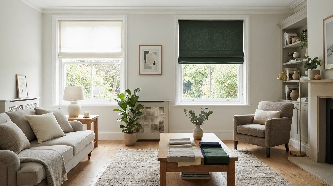
Your blinds don’t have to match your walls. Choosing the right colour for blinds is about balancing the room, whether you prefer a subtle blend or a confident contrast. A shade that picks up a detail in your furnishings can feel just as considered as one that echoes the walls.
It’s understandable to focus on colour first: blinds cover a prominent part of the window, and their shade can change how the whole room feels. But the best choice also depends on natural light, the mood you want and, in a conservatory, how the colour may affect heat.
This guide will help you compare shades with your walls and décor, consider light and room size, and choose colours for different spaces. You’ll also find practical guidance for conservatories, where lighter blinds can help the room feel cooler in hot summer weather. By the end, you’ll have a clearer way to choose a colour that feels right in your home.
Key Takeaways
- Blinds don’t have to match your walls. Echo a colour elsewhere in the room or choose a deliberate contrast for a more distinctive look.
- Consider natural light before settling on a shade: lighter colours can help brighten a dim room, while darker tones can create a cosy feel.
- Compare the blind’s undertone with your walls, flooring and furnishings to keep the room’s palette feeling harmonious.
- In a conservatory, lighter-coloured blinds can help the space feel cooler during hot summer months.
- For a small room, lighter blinds can reflect light and help the space feel more open; try samples in the room to see how the shade looks in its natural light.
1. Should blinds match the colour of your walls?
No. Blinds don’t have to match your walls; they should relate to the room’s wider palette. A pale grey blind can sit quietly against white walls, while deep blue can create deliberate contrast. Choose a close shade for a subtle finish, or a contrasting colour when you want the window to add character. There’s no single style rule to follow.
Start with the room’s design and the details you want the blind to complement. Natural textures, such as a wooden side table, pair well with earthy shades. In a modern room with simple furnishings, a brighter accent can add personality. In a bedroom with patterned bedding, a calmer blind colour can connect the window to the room without repeating every pattern.
Look beyond the walls before choosing. A blind can pick up the colour of a cushion, rug, mantelpiece or picture frame. For example, muted green can relate to leafy details or a small plant. In an open-plan space, repeating a blind colour can link adjoining areas; separate rooms can have their own schemes.
White and cream blinds can make a room feel bright and airy. They suit smaller rooms and can soften darker walls without competing with artwork or statement furniture. A cream blind against charcoal walls creates contrast, while white in a neutral room keeps the finish light. Compare undertones too: warm cream may sit more comfortably beside warm whites than cool grey-white walls.
Too much of one strong shade can overwhelm a room. Instead, choose a main colour and balance it with a related tone or restrained accent. For example, pair bold blue walls with a neutral blind, or choose a blind slightly lighter or darker than the wall. This adds definition without making every surface compete for attention.
Which blind colours fade least in sunlight? Colour alone doesn’t determine fading; sunlight exposure and material matter. Fabric blinds can fade over time in intense sunlight, while vinyl and aluminium typically maintain their colour better with proper care. UV-resistant blinds in lighter hues can help reduce fading on windows exposed to direct sun.
Finally, consider how the colour and finish affect the room’s atmosphere. Darker blinds absorb light and can create a cosy, intimate feel; lighter shades reflect available light. Compare the blind with the wall and furnishings in the room, then choose the combination that feels balanced in your home.
2. How blind colour affects natural light and perceived space
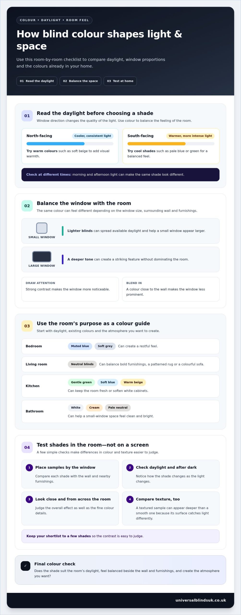
For bedrooms, muted blue or soft grey can create a restful feel. Living rooms with bold furnishings often suit neutral blinds, while a simple kitchen can take gentle green or soft blue. The best choice depends on the room’s daylight, window size and existing colours.
A lighter blind can help a small window appear larger by spreading available daylight. On a large window, a deeper tone can create a striking feature without dominating the room. Consider the view and the wall around the window, too. Strong contrast draws attention to the opening, while a close colour blend makes it less prominent.
Window direction changes the quality of daylight. North-facing windows receive cooler, more consistent light, so warm colours such as soft beige can add visual warmth. South-facing windows receive warmer, more intense light, where cool shades such as pale blue or green can feel balanced. Look at the window at different times of day before deciding: morning and afternoon light can make the same shade look different.
Test colour samples at home rather than relying on a screen. Place each sample beside the window and compare it with the wall and nearby furnishings in daylight and after dark. Check the colour from across the room as well as close up. A textured sample can appear deeper than a smooth one because its surface catches light differently. Keep your shortlist to a few shades so the contrast is easy to judge.
In a bathroom, white, cream or another pale neutral can help the space feel clean and bright. These tones also reflect natural light, which can be useful in a bathroom with a small window. In a kitchen, lighter colours can keep the room feeling fresh and open. Warm beige, for example, can soften white cabinets, while muted green can pick up natural textures such as wooden worktops.
Consider how the colour works with the room’s purpose and materials. In a bedroom, a soft, cool shade can contribute to a calmer atmosphere; in a living room, a neutral can balance a patterned rug or colourful sofa. In a kitchen with pale cabinetry, a blind in a related tone creates a quiet finish. A contrasting colour makes the window a more noticeable feature.
If a window’s proportions make the colour selection difficult, made-to-measure blinds can be tailored to its dimensions, helping the finished look feel balanced.
3. Matching blinds to existing décor and undertones
Begin with the colours already established in the room, rather than choosing a blind in isolation. Look at the walls, flooring, furniture and largest soft furnishings. A blind can repeat one of those shades to create a connected scheme, or introduce a related colour for gentle contrast. For example, a muted green blind can complement natural wood and leafy details without matching either exactly.
Undertones help explain why some colours sit comfortably together. Cream with a yellow undertone tends to work well with warm beige, while a cool grey wall can pair naturally with blue-grey shades. Hold the colours beside each other and compare their visual temperature: do they both feel warm, or do they pull in opposite directions? A deliberate contrast can look striking, but an accidental clash may make the palette feel unsettled.
Use furnishings as a practical colour guide. Pick a noticeable detail, such as a cushion, rug or chair, and choose a blind shade that relates to it. A neutral blind can balance a patterned sofa, while a darker version of a colour already used in the room can add depth. If the furniture is already a statement, a quieter shade helps keep attention on it.
Curtains offer another useful reference. Matching blind and curtain colours can create a cohesive finish, particularly when both frame the same window. If an exact match feels too uniform, choose a blind slightly lighter or darker than the curtains. For example, a pale grey blind can sit against charcoal curtains while keeping to the same colour family. This defines the window without adding an unrelated shade.
For a warmer scheme, consider reds, oranges and yellows in living or dining areas. These colours can create an inviting atmosphere, especially alongside warm wood and cream furnishings. Blues, greens and greys tend to feel cooler and calmer. They can suit a room with crisp white details or a restrained, contemporary palette. Match the overall tone, rather than simply choosing a favourite colour.
In an open-plan room, repeating one blind colour can link spaces with different furniture. Alternatively, use different shades from the same palette to distinguish each area while maintaining continuity. For example, a living area might use a soft neutral, while the adjoining dining space uses a deeper shade of that colour. Start with a shade that complements the room’s largest surfaces; smaller accents can then provide contrast.
Before deciding, view the blind colour alongside the main furnishings and curtains, not just the wall. This simple comparison shows whether the shade supports the room’s design or competes with its strongest features.
4. Choosing colours to complement existing décor
Start with the room’s fixed features, such as flooring, kitchen units or a fireplace. These are less likely to change than cushions or accessories, so they offer a useful colour anchor. For example, a warm beige blind can complement oak flooring and cream walls. If the room has patterned wallpaper, choose a quieter shade from its design to connect the window with the wider interior.
Consider how much attention you want the blind to attract. A neutral colour can let a statement sofa or artwork remain the focal point, while a stronger shade can make a plain window stand out. In a modern room with white walls and simple furniture, deep green can add definition. If the room already has colourful artwork, patterned upholstery and bold accessories, a restrained shade can bring balance.
For a versatile choice, look at colours that work with several existing features rather than just one accessory. Soft grey, warm beige and muted natural tones can complement different furniture finishes and décor styles. A blind that relates to both the wall and flooring is less dependent on a cushion or rug that might change. This leaves more options if you later refresh smaller details.
Think about future changes before settling on a strong colour. If you plan to repaint, choose a shade that can sit comfortably beside more than one wall colour. For example, a muted neutral can work with pale green now and soft cream later. If you’re keeping bold wallpaper or a colourful sofa, a coordinating blind can stay in place while other accents change.
Blinds don’t need to match the floor exactly. In a room with dark wood flooring, a lighter blind can lift the window area; a related darker shade can make the interior feel more grounded. Compare the main surfaces together in the room, rather than judging each colour alone. Notice how daylight changes the contrast between the blind, floor and furniture, then choose the combination that best suits the room’s purpose.
For a consistent feel across an open-plan home, repeat a colour family instead of using identical shades everywhere. A living room might use soft grey, while an adjoining dining area uses a deeper grey with the same undertone. This creates a link without making every window look the same. Separate rooms can use different colours and still feel cohesive if they complement recurring details, such as wood finishes or metal fittings.
Finally, consider the finish as well as the colour. A smooth, pale blind can reflect light and keep a pared-back room feeling fresh, while a deeper shade can add visual weight beside light walls. Compare the colour with your largest surfaces first, then check it against smaller details. This simple sequence helps the finished scheme feel intentional rather than assembled from unrelated choices.
5. What blind colours make a small room look bigger or brighter?
Light-coloured blinds can help a small room feel brighter and more spacious by reflecting available light. White and beige are useful starting points, but match the shade to the room’s existing finishes. In a narrow hallway, a soft neutral can stop the window from feeling like a dark block. In a compact bedroom, a warm pale tone can soften the view without adding visual weight.
Consider the window frame and surrounding wall, not just the blind. A shade close to the wall colour creates a continuous visual line, helping the window area feel less divided. For example, pair an off-white blind with a warm white wall rather than introducing a sharp, high-contrast colour. If the frame is dark, a lighter blind can still brighten the opening while defining the window.
Proportion matters too. On a small window, a strong colour can draw attention to its size, while a light shade keeps the overall effect quieter. If the room has one larger window, a deeper colour there can act as a focal point without making every wall feel closer. In a small living room, keep the blind understated and let a cushion or artwork provide the stronger accent.
Look at the room from its entrance. In a landing, for instance, notice whether the blind creates a visual stop at the far end. A pale shade that relates to the wall can help the eye travel across the space. Repeating that colour on a nearby door or trim can strengthen continuity, while a contrasting blind may make the window stand out more.
Keep the palette controlled. Choose one light base, such as cream, then add one or two accents through furnishings. A small room with cream walls, a pale blind and a muted green cushion feels more connected than one combining several unrelated strong colours. If you prefer darker shades, use them selectively, perhaps on one prominent window rather than every small opening.
Before deciding, compare the blind colour with the wall, frame and floor in the actual room. A sample that looks pale in a bright shop can appear stronger beside a shaded window. Check it from the doorway and seating area, too. These viewpoints show whether the blind helps the room feel open or creates an unwanted visual boundary.
For a small or unusually shaped window, explore made-to-measure blinds tailored to its dimensions and the look you want.
Universal Blinds UK: Made-to-Measure Blinds
Universal Blinds UK supplies and fits made-to-measure blinds and shutters for homes and businesses in the West Midlands. If a window has unusual dimensions or you want a finish that suits your room, the free measuring service helps establish the measurements before fitting. Professional fitting completes the process, with your chosen colour and style considered alongside the window itself.
Custom shutters are another option when comparing window treatments. The right choice depends on the look you want and how you use the room. Universal Blinds UK offers home consultations and free measuring, so you can consider colours and styles in relation to your walls, furnishings and natural light.
To discuss made-to-measure blinds for your home, contact Universal Blinds UK or visit universalblindsuk.co.uk.
Choose a colour that feels right for your home
Your home doesn’t need to follow a fixed colour rule or a passing trend. The best choice is one you’ll enjoy seeing every day, in the room as it’s actually used. Take a final moment to picture the finished window alongside the details that matter most to you, whether that’s a calm atmosphere, a distinctive accent or a more polished feel.
Choosing the right colour for blinds is ultimately a personal design decision. Trust the combination that feels coherent in your space, rather than aiming for a perfect match on paper. A considered shade can help your room feel more like yours.
If you’re ready to take the next step, contact Universal Blinds UK today to discuss your window plans. Your chosen colour can be the starting point for a room you’ll feel happy coming home to.
Frequently Asked Questions
Should blinds match the colour of your walls?
No, matching is optional. A blind can blend with the walls for a quieter look, or pick up a colour from a chair, lampshade or picture frame instead. For example, in a room with pale walls and a terracotta armchair, a muted earthy blind can connect the two. Consider the whole room rather than treating the wall as the only colour reference.
Should Blinds Be Lighter or Darker Than Walls?
Either can work, depending on the effect you want and the room’s daylight. A lighter blind can make a window feel less prominent, while a darker one can give it definition. In a bright room with pale walls, a deeper shade can add contrast without making the space feel heavy. Compare the colours side by side before choosing, as undertones affect how the contrast appears.
How do you choose a blind colour to match a room’s walls and décor?
Choosing the right colour for blinds starts with identifying the room’s dominant colours, then selecting a shade that repeats one or sits comfortably alongside them. A blind that echoes a small detail, such as a lampshade or framed print, can make a scheme feel intentional. If the décor includes several patterns, choose a calmer shade already present in one of them. Check the sample beside the wall and furnishings, not in isolation.
Should blinds be lighter or darker than the walls?
There’s no fixed rule, so decide what you want to stand out. Choose a blind close to the wall colour if you want the window to recede visually. Pick a deeper or contrasting tone when you want the window to become a feature. For a balanced result, compare the blind with the wall, frame and floor together; a strong contrast against all three can draw more attention than intended.
How does natural light and window direction affect blind colour choice?
Window direction influences the light that falls on a blind and how its colour appears. A north-facing room receives cooler, more consistent light, which can make warm shades feel inviting. South-facing rooms receive warmer, more intense light, where cooler colours may feel more balanced. View a sample at the window at different times of day, because daylight can change its appearance across the room.
How do blind colours compare with curtains and window frames?
Blinds can match curtains for a coordinated window, or use a related shade for gentle variation. For example, a soft grey blind beside darker grey curtains keeps the colours connected while distinguishing the layers. Also consider the frame: a blind that relates to a white frame creates a different effect from one that contrasts with dark timber. Judge all three together before settling on a colour.
What colour blinds work best in neutral or colourful interiors?
Choosing the right colour for blinds in a colourful interior can mean selecting a neutral shade to provide visual breathing space and keep attention on patterned furnishings or artwork. In a neutral room, rich blue, an earthy tone or a soft pastel can introduce personality without changing the whole scheme. For a more unified look, choose a shade already present, then decide whether it should blend in or create a clear accent.
Do light or dark blinds provide better heat control and privacy?
Lighter blinds can help keep a conservatory cooler in hot summer weather, while darker blinds may absorb heat and make a room warmer in direct sunlight.